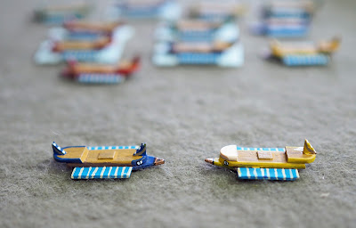
A thread on the Galleys & Galleons Facebook group concerning ancient galleys got me thinking about the ones I made a couple of years ago. I'd played a few games with them, but had never been entirely satisfied with the models, and had always felt they needed a redesign. They obviously date from before I started using printed sea-bases and oars, so that upgrade was always on the cards, but I'd never felt that the look was quite right.
Anyway, yesterday I did some research (I Googled 'trireme' in an image search) had another look at my models, and came up with a redesign that I think captured their look a little better.
On the left is the original galley. On the right is my slight redesign - another layer in the prow and a reversal of the stern post to better capture that curved look they have.


I like the elegant simplicity of this design. In fact I'm thinking seriously of copying it - or at least adapting the design to Byzantine dromons. Thanks for the pic!
ReplyDeleteA slight improvement I agree, however the originals still take some beating. Top stuff as usual.
ReplyDeleteI’m with JBM on this. Great work.
DeleteAmazing the a difference a simple little change can make. I do like the simplicity of your scratch-built ships, very effective.
ReplyDelete